Through many iterations of the visual language, I worked to design a clean and modern style, unique in the world of MMORPGs. I relied on white space as much as possible to create natural divisions between text and images, instead of using excessive borders and dividers.
I used consistent typeface styles to create hierarchies of information, which is especially important in text-heavy interfaces. I also converted the type to support localization of other latin-based languages and Cyrillic. OpenSans was chosen as the game’s typeface for most in-game text based on its readability, large character set, and numerous weights.
Some of the most common player interactions with Crowfall’s UI are through various floating windows, which are used for the game’s more prominent self-contained features.
Based off of complete mockups I made in Illustrator, Photoshop, and Adobe XD, I constructed these in Unity, using its UI toolset. I made full use of the layout tools, including layout groups and content size fitters, to ensure the windows’ contents look consistent at different sizes and aspect ratios.
These examples can take the form of small contextual popups or large, prominent features. The leaderboard in particular went through numerous iterations of different sizes and layouts throughout development.
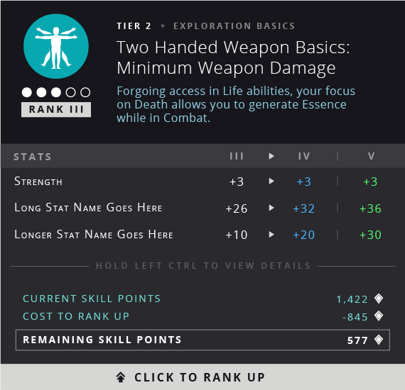
Being an MMO, Crowfall requires the player to be able to view a lot of information, and it can't all be on screen at once. Tooltips were used throughout the UI to provide very detailed information.
The game design would often require large amounts of text in these tooltips, providing the challenge of displaying all of the necessary information in an understandable way. This made it especially important to effectively use different text styles, colors, spacing, and capitalization to create clear hierarchies of information.
The power icons are featured in the HUD and in various menus. They follow a consistent design language that gives the player insight into what the given power will do. Each one is comprised of its unique, single-color foreground iconography, a shape, and a color fill in the background. The shape and color language are used to define key properties of the powers.
I created many other types of icons throughout the UI, including the inventory and skill trees. Each skill icon was constructed in Unity to support several possible colors and different animated fills to give them a mystical quality. I did keep them visually simple, however, as the large number of nodes on screen at once required them to be readable at any size.
Visualizing interfaces in motion is crucial when it comes to understanding the visual direction and user feedback you expect from the final product. For several important features, this would be my next step after wireframes were approved.
Fullscreen motion comps were made in After Effects, while the animated time bank is an example of animation made directly in-engine.


Interactions in Crowfall are divided into two main paradigms: camera mode, where the camera is locked to the cursor during gameplay, and cursor mode, where the player can interact with the floating windows and menus. One design requirement I had for this particular menu was that it needed feel like a D&D character sheet, with many visible stats and immediately accessible character equipment. Here, I tested variants with and without the main inventory, displaying differing quantities of stats, and showing and hiding the hotbar, used for quick item switching.


When planning a list of social features, I got handed a list of requirements based on standard MMO features. In addition to the requirements, I concepted designs that feature quality-of-life enhancements, such as chat tabs inside a horizontal scroll box, enabling the use of the scroll wheel in that area, and the ability to create a new chat channel when adding a new tab, streamlining the process.
During development of the crafting system, I assisted in concepting an alternate layout that displayed crafting trees, so the player could view the full requirements for the end product at a single glance. I also concepted the crafting experimentation feature, which acted as a minigame that let the player customize their item with risk/reward mechanics.
Wireframing is a process I use often, especially when working on a large feature that I know will contain numerous states and require a lot of different pieces of user feedback. Here, I started designing the rough layouts of each state in Adobe XD. Being able to make the wireframes interactive was valuable because I could arrange internal user tests to see what worked, what didn’t, and then iterate on the user flow before designing the final visuals.